7-day free trial, first charge on 2017.5.6
There are 8 sections/projects. Each section has about 10 lessons.
The instructor is Patrick Nussbaumer, director of Alteryx. The core courses are implemented in Alteryx. This software is pretty expensive. Annual subscription fee is 5.2 k for the desktop version and 2 k for cloud version.
1 Problem solving with analytics
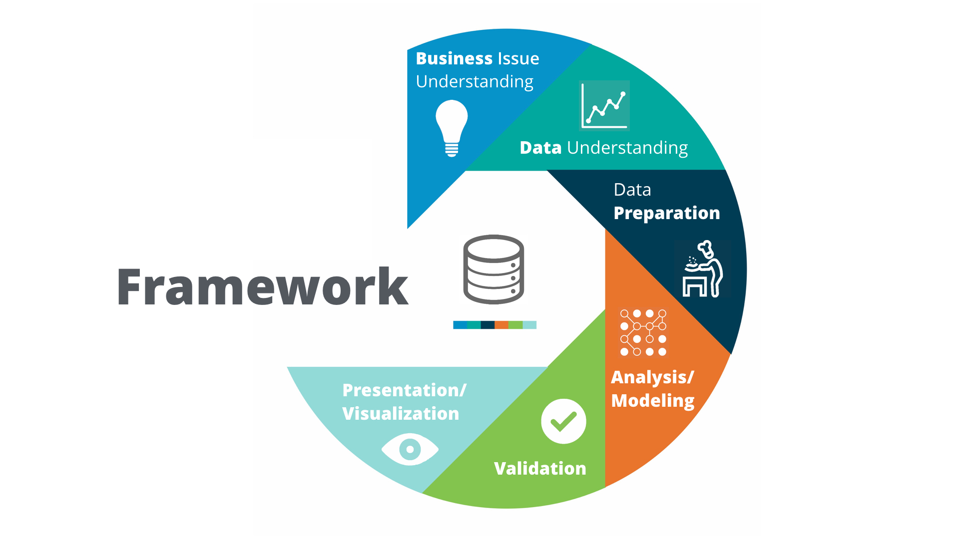
1.3 Analytical problem-solving framework
Problem-solving framework: Cross Industry Standard Process for Data Mining (CRISP-DM).
Predictive methodology map
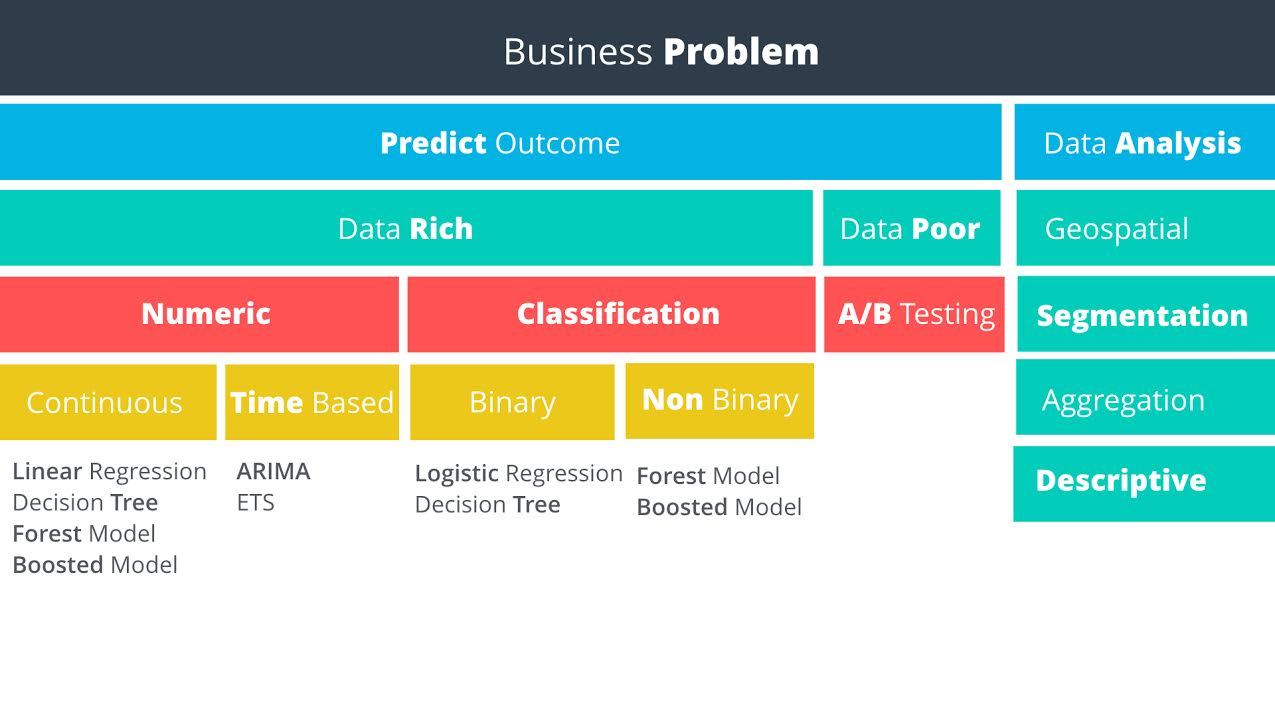
Data rich vs data poor: Do you have data on what you want to predict?
1.5 Linear Regression
You can do single or multiple variable linear regression in Excel.
For categorical variables, it doesn’t make sense to assign value 1, 2, 3. Instead, it is better to use dummy variables, also called one hot encoding. Alteryx can do such things, but sadly, it has the only windows version. Alternatively, Weka is open source and has a mac version. Sadly again, it is ugly and can not even parse csv correctly.
1.5.21 interpreting linear regression results
P Value
The p-value is the probability that observed results (the coefficient estimate) occurred by chance, and that there is no actual relationship between the predictor and the target variable. In other words, the p-value is the probability that the coefficient is zero. The lower the p-value the higher the probability that a relationship exists between the predictor and the target variable. If the p-value is high, we should not rely on the coefficient estimate. When a predictor variable has a p-value below 0.05, the relationship between it and the target variable is considered to be statistically significant.
Statistical Significance - “Statistical significance is a result that is not likely to occur randomly, but rather is likely to be attributable to a specific cause.”
Note that p-values can be the ones for the coefficients of a linear model (sadly not provided by
sklearn.linear_model.LinearRegression) or the one computed by a significance test from sklearn.feature_extractionR-Squared
In our example, the R-squared value is 0.9651, and the adjusted R-squared value is 0.9558. Therefore, we’ve been able to improve the model with the addition of the category. In a real life problem, we might run the model with different predictor variables, or see if we had additional information to add to the model.
Remember, R-squared ranges from 0 to 1 and represents the amount of variation in the target variable explained by the variation in the predictor variables. The higher the r-squared, the higher the explanatory power of the model.
project 1: catalog campaign
key knowledge points:
- linear regression, including
seaborn.regplot,seaborn.jointplot,sklearn.linear_model.Ridge,satsmodels.api.sm - manipulate pandas DataFrame, including
pandas.get_dummies,pandas.concat([], axis =1),pandas.drop(column, axis=1),df.dropna(axis=0,inplace=True)
2 data wrangling
data sources:
- computer file: MS Excel, Access,MapInfo, ArcGIS,SAS, SPSS,csv
- databases
- web-based sources
project 2.1: select a new store location
key pieces of knowledge:
- use the regular expression to search text.
- use
bs4.BeautifulSoup(string,'html.parser').find(tag).textto extract data - learn to make business decision
project 2.2: create report from database
SQL practice use software http://sqlitebrowser.org/ and chinook database.
notes:
- waste a lot of data on data visualization, especially how to control the size of axis, tickers, hue.
- use SQLite built-in function to parse daytime, such as
strftime('%Y', string),strftime('%m', string). Or usedate("now")to report time
3 data visualization
Tableau
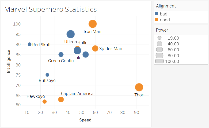
“https://d17h27t6h515a5.cloudfront.net/topher/2017/February/589e6575_superheroplot/superheroplot.png “ >
Q1: How have movie genres changed over time?
This is a countplot by year and hue by genres.
I tried to do it in seaborn/matplotlib first, but surrendered to Tableau due to following reasons:
- genres are usually not single type, you have to split the string. Tableau is one click, Python do it by
df['genres']= df['genres'].apply(lambda s: str(s).split("|")[0]) - countplot is actually an aggregation function + barplot. But 20 genres will make the barplot pretty ugly. So it is better to have line plot, which is easily done in Tableau. In python, a line of code
sns.countplot(x = "release_year", hue = "genres", data = df[df["release_year"]>2000])doesn’t give what you want. If you stick to python, thengb = df[df["release_year"]>2000].groupby(["release_year", "genres"]).count(), but groupby plot is not polished module. You get much more to do than necessity. - python plot must decide which group of data to show. But you never know which one to show until you plot. In Tableau, just plot and use a filter to show the most important information,
Operation on Tableau:
- In data source, split the “Genre” which automatically takes first two.
- In Sheet,drag x value to “Columns”, y value to “Rows”, label value to “Marks” or “Filters”. The default setting for Measures type is an aggregation called SUM. That’s why when you drag two sets of numerical data, you don’t see scatter plot but a single one point. To avoid that, set it to Demesion.
- Aggregation is over all the records. To put aggregation on condition, SQL use
on a = b group by c. Tableau does it by dragging data to Marks, the default granularity is details, which is just a subtle grid.
- Question 2: How do the attributes differ between Universal Pictures and Paramount Pictures?
- Question 3: How have movies based on novels performed relative to movies not based on novels?
CONTAINS([Keywords], "novel")
5 classification models
The project is a binary classification. Dataset has shape (500,20). Most of the features are categorical.
Workflow:
- Examine each feature by
seaborn.countplot()orseaborn.boxplot() - drop features of bad quality:
pd.drop(feature_list, axis=1, inplace = True) - fillna with median value:
data["Age-years"].fillna(median_age, inplace=True)median_age is preserved for latter unseen data - make two variable lists: measures and dimensions
dummies = pd.get_dummies(data[dimensions])- a more secure way is to use
from sklearn.preprocessing import OneHotEncoderbecause the encoder can remember the correct order and number in case unseen data has fewer classes. - scale the numerical data by
from sklearn.preprocessing import MinMaxScaler - stack them together:
features = np.hstack((hot, dummies.values,m)) - dummy target:
target = pd.get_dummies(data["Credit-Application-Result"])['Creditworthy'] - time for machine learning:
from sklearn.model_selection import train_test_split
X_train, X_test, y_train, y_test = train_test_split(features, target, test_size = 0.3, random_state = 0)
from sklearn.tree import DecisionTreeClassifier
model = DecisionTreeClassifier()
model.fit(X_train, y_train)

from sklearn.metrics import accuracy_score
y_predict = model.predict(X_test)
score = accuracy_score(y_test, y_predict)
print("score: ", score)

from sklearn.ensemble import RandomForestClassifier
from sklearn.svm import SVC
Full implementation see: https://github.com/jychstar/NanoDegreeProject/tree/master/BAND/p4_credit_approval