Friday, May 5, 2017

Business Analyst ND 2, AB test, time series, cluster


6 A/B test

Experimental design

treatment group vs control group
target vs control variable: causal relation.
Lurking variable (confounding): e.g Temp. in Death rate vs. Ice-cream
experimental, predictor variables
Two kinds of designs:
  • randomized design: use if data is low cost and no bias
  • matched pair design: use if data is high cost
use its built-in function T.TEST(data1,data2, tails,type) to see p-value. If the p-value is smaller than 0.05 , means low probability of randomness, then statistically significant. It is more accurate for statisticians to say correlation rather than causal relation. Because we want to find the useful relation, so p-value is lower the better.

project

compare the sale before and after a new menu. To avoid seasonal factors, use the same dates in last year vs this year.
How to parse a specific date to the number of weeks in the year?
Commercial software like Alteryx has specially designed to address this problem, and it is only one click!
Anyway, I can do it in python, as I posted in stackoverflow.

8 Time series forecasting

Two models:

8.1 ETS: Exponential smoothing.

Decomposition plot (season, trend, error).
  • Seasonal (no, constant, increasing)
  • trend (no,linear, exponential)
Simple Exponential smoothing
This method is suitable for forecasting data with no trend or seasonal pattern.
p= \alpha\sum_{i=0}\beta^ip_i
where \beta=1-\alpha
p is the price for tomorrow, p0 is the price for today, i= 1 is the price for yesterday,… We can easily prove the sum of total weights is 1.
An example is:
If there’s a trend, more complicated method is used, such as Holt’s linear trend method: https://www.otexts.org/fpp/7/2
Anyway, Alteryx has everything built-in for you.

8.2 ARIMA: Auto regressive integrated moving average

  • AR: use p points to do a linear regression
  • I: difference d points
  • MA: Error Component of a linear regression of q points
Overall, this is single variable (time) prediction, it assumes all the other variables are condensed or represented by this variable, which is often not possible. Many variables are independent variables.

9 Segmentation and clustering

Basically, it’s unsupervised learning.
Standardizing vs localizing is a tradeoff between one-size-fits-all solution and customized solution.
Business perspective says segment, statistics perspective says clusters.
Definition: A mathematical procedure for multidimensional analysis. Given the characteristics of a set of objects, this procedure groups similar objects into clusters.
reduce the variables to artificial/component variables.
PCA catches the variance of all variables.
Because everything is packaged in the software Alteryx, it is not supposed to an in-depth course. What interests me most is how the questions are presented in a business context and how the solution is used to help to make the business decision.
This ends my 7-day free trial BAND journey. Other unfinished project materials can be found in https://github.com/jychstar/NanoDegreeProject/tree/master/BAND
​

Wednesday, May 3, 2017

Business Analyst ND 1, linear regression, data wrangling, binary classifier

7-day free trial, first charge on 2017.5.6
There are 8 sections/projects. Each section has about 10 lessons.
The instructor is Patrick Nussbaumer, director of Alteryx. The core courses are implemented in Alteryx. This software is pretty expensive. Annual subscription fee is 5.2 k for the desktop version and 2 k for cloud version.

1 Problem solving with analytics

1.3 Analytical problem-solving framework

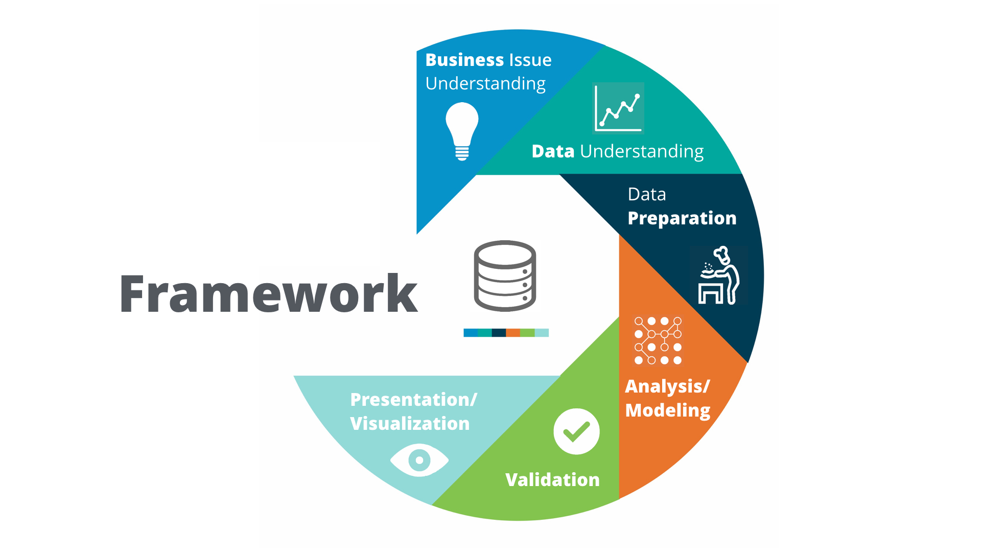
Problem-solving framework: Cross Industry Standard Process for Data Mining (CRISP-DM).
Smiley face
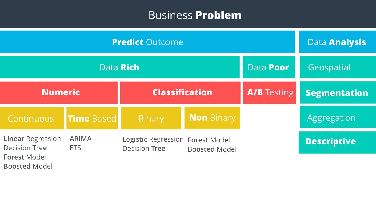
Predictive methodology map
Smiley face
Data rich vs data poor: Do you have data on what you want to predict?

1.5 Linear Regression

You can do single or multiple variable linear regression in Excel.
For categorical variables, it doesn’t make sense to assign value 1, 2, 3. Instead, it is better to use dummy variables, also called one hot encoding. Alteryx can do such things, but sadly, it has the only windows version. Alternatively, Weka is open source and has a mac version. Sadly again, it is ugly and can not even parse csv correctly.

1.5.21 interpreting linear regression results

P Value

The p-value is the probability that observed results (the coefficient estimate) occurred by chance, and that there is no actual relationship between the predictor and the target variable. In other words, the p-value is the probability that the coefficient is zero. The lower the p-value the higher the probability that a relationship exists between the predictor and the target variable. If the p-value is high, we should not rely on the coefficient estimate. When a predictor variable has a p-value below 0.05, the relationship between it and the target variable is considered to be statistically significant.
Statistical Significance - “Statistical significance is a result that is not likely to occur randomly, but rather is likely to be attributable to a specific cause.”
Note that p-values can be the ones for the coefficients of a linear model (sadly not provided by sklearn.linear_model.LinearRegression) or the one computed by a significance test from sklearn.feature_extraction

R-Squared

In our example, the R-squared value is 0.9651, and the adjusted R-squared value is 0.9558. Therefore, we’ve been able to improve the model with the addition of the category. In a real life problem, we might run the model with different predictor variables, or see if we had additional information to add to the model.
Remember, R-squared ranges from 0 to 1 and represents the amount of variation in the target variable explained by the variation in the predictor variables. The higher the r-squared, the higher the explanatory power of the model.

project 1: catalog campaign

key knowledge points:
  1. linear regression, including seaborn.regplot, seaborn.jointplot, sklearn.linear_model.Ridge, satsmodels.api.sm
  2. manipulate pandas DataFrame, including pandas.get_dummies, pandas.concat([], axis =1), pandas.drop(column, axis=1), df.dropna(axis=0,inplace=True)

2 data wrangling

data sources:

  1. computer file: MS Excel, Access,MapInfo, ArcGIS,SAS, SPSS,csv
  2. databases
  3. web-based sources

project 2.1: select a new store location

key pieces of knowledge:
  1. use the regular expression to search text.
  2. use bs4.BeautifulSoup(string,'html.parser').find(tag).text to extract data
  3. learn to make business decision

project 2.2: create report from database

SQL practice use software http://sqlitebrowser.org/ and chinook database.
notes:
  1. waste a lot of data on data visualization, especially how to control the size of axis, tickers, hue.
  2. use SQLite built-in function to parse daytime, such as strftime('%Y', string), strftime('%m', string). Or use date("now") to report time

3 data visualization

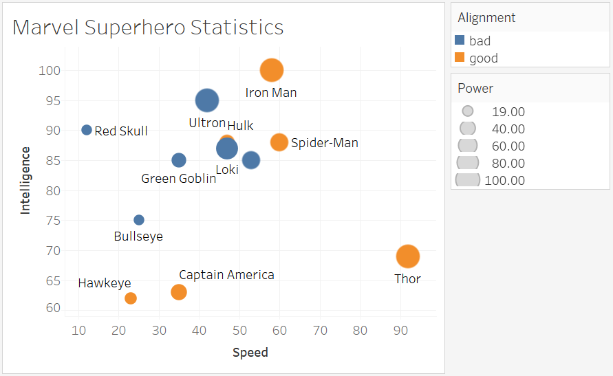
Tableau
Smiley face

Q1: How have movie genres changed over time?

This is a countplot by year and hue by genres.
I tried to do it in seaborn/matplotlib first, but surrendered to Tableau due to following reasons:
  1. genres are usually not single type, you have to split the string. Tableau is one click, Python do it by df['genres']= df['genres'].apply(lambda s: str(s).split("|")[0])
  2. countplot is actually an aggregation function + barplot. But 20 genres will make the barplot pretty ugly. So it is better to have line plot, which is easily done in Tableau. In python, a line of code sns.countplot(x = "release_year", hue = "genres", data = df[df["release_year"]>2000]) doesn’t give what you want. If you stick to python, then gb = df[df["release_year"]>2000].groupby(["release_year", "genres"]).count(), but groupby plot is not polished module. You get much more to do than necessity.
  3. python plot must decide which group of data to show. But you never know which one to show until you plot. In Tableau, just plot and use a filter to show the most important information,
Operation on Tableau:
  1. In data source, split the “Genre” which automatically takes first two.
  2. In Sheet,drag x value to “Columns”, y value to “Rows”, label value to “Marks” or “Filters”. The default setting for Measures type is an aggregation called SUM. That’s why when you drag two sets of numerical data, you don’t see scatter plot but a single one point. To avoid that, set it to Demesion.
  3. Aggregation is over all the records. To put aggregation on condition, SQL use on a = b group by c. Tableau does it by dragging data to Marks, the default granularity is details, which is just a subtle grid.
  • Question 2: How do the attributes differ between Universal Pictures and Paramount Pictures?
  • Question 3: How have movies based on novels performed relative to movies not based on novels? CONTAINS([Keywords], "novel")

5 classification models

The project is a binary classification. Dataset has shape (500,20). Most of the features are categorical.
Workflow:
  1. Examine each feature by seaborn.countplot() or seaborn.boxplot()
  2. drop features of bad quality: pd.drop(feature_list, axis=1, inplace = True)
  3. fillna with median value: data["Age-years"].fillna(median_age, inplace=True) median_age is preserved for latter unseen data
  4. make two variable lists: measures and dimensions
  5. dummies = pd.get_dummies(data[dimensions])
  6. a more secure way is to use from sklearn.preprocessing import OneHotEncoder because the encoder can remember the correct order and number in case unseen data has fewer classes.
  7. scale the numerical data by from sklearn.preprocessing import MinMaxScaler
  8. stack them together: features = np.hstack((hot, dummies.values,m))
  9. dummy target: target = pd.get_dummies(data["Credit-Application-Result"])['Creditworthy']
  10. time for machine learning:
from sklearn.model_selection import train_test_split
X_train, X_test, y_train, y_test = train_test_split(features, target, test_size = 0.3, random_state = 0)
from sklearn.tree import DecisionTreeClassifier
model = DecisionTreeClassifier()
model.fit(X_train, y_train)

from sklearn.metrics import accuracy_score
y_predict = model.predict(X_test)
score = accuracy_score(y_test, y_predict)
print("score: ", score) 

from sklearn.ensemble import RandomForestClassifier
from sklearn.svm import SVC
​

Monday, May 1, 2017

Tournament project revisited, SQLite, vagrant


format SQL online: https://sqlformat.org/
format SQL in python: https://sqlparse.readthedocs.io/
Recap1 is when I started to learn SQL 10 months ago by doing the Tournament project for the Intro to Programming Nanodegree.
However, I have to admit I almost forget everything, such as why I use vagrant and virtual box, why the reviewer insists not letting me using the view. Now I am using SQL again for Business Analyst Nanodegree, and it is a good time to look back and bridge my knowledge gap.
Recap 2 is in Data Analyst Nanodegree, where compared different SQL systems. Basically, SQL Server is sold by Microsoft and MySQL by Oracle, while the free meals are SQLite by D. Richard Hipp and PostgreSQL by UC Berkeley.
In my opinion, the starting point to learn should be SQLite. You just type sqlite3 in the terminal to have fun. But Tournament project from IPND does it the hard way by using PostgreSQL. This requires you to build a virtual machine to run the server, which is through Vagrant and Virtual Box.

Vagrant

The difference between Virtual machine and Docker is here.
Vagrant is an open-source software released in 2010. It is a configuration tool to help you set up the virtual environment. It was originally tied to VirtualBox and now has added support for VMware, KVM, Amazon EC2 or even Docker. The configuration information is written in “Vagrantfile” by Ruby.
You only need to remember 3 simple commands:
vagrant up # execute Vagrantfile to run virtual machine
vagrant ssh # enter the virtual environment
logout  # exit
Follow project description and get the newest Vagrant file. With my Virtual box installed, vagrant up will automatically check the environment and download 1GB .vmdk file to my Virtual box folder.
After a few minutes, the virtual machine is installed and vagrant ssh brings me to an exciting world. The welcome message shows a Ubuntu 16 and shared directory is at /vagrant.
Play around. I find python 2.7.12 and psql 9.5.6. Sadly no jupyter and it refuse to install that. No ipython but it suggest sudo apt install ipython But still impossible to use my favorite notebook even if I get ipython-notebook and firefox installed.
Get back to work by psql. Once inside, you will need:
\c tournament  # connect to xxx database
\i tournament.sql  # import sql commands in .sql file
\d matches   # describe xxx table 
\dt      # describe all the tables 
\q   # quit and have fun
Note this psql environment is a perfect place for experimenting sql queries where you can get immediate feedback. tournament.sql is used for setting up schema and database. While tournament.py is where you define python function by SQL queries, and tournament_test.py is testing these function and outputting results.
Because python needs to interact with the database, so both psql and python must in the same Ubuntu shared folders. In reality, you use 2 terminal windows to do the job.
Once you quit psql and logout , check vagrant status. You will see the virtual machine is still running and your python SQL query still works! If you open Virtual Box, you will see it runs happily.
To end these, type vagrant suspend. You will see Virtual Box simultaneously close this virtual machine and the python side also quit automatically.

sqlite implementation of tournament project

To refresh my memory and get it straight, I reimplement the project by SQLite in jupyter notebook. This step-by-step learning process will help clarify the concepts and expose the difficulties.
Codes are in my github.
Basically, there are 2 points worth mentioning in the refactoring:
  1. SQLite doesn’t have serial data type, but you can use integer autoincrement
  2. the placeholder in the insert command in SQLite is also slightly different
  3. the first difficulty is in the playStandings(). There are actually two aggregations: one count for wins, another count for games. You either use a view/subquery or use case when xx then x else x end grammar to do the job
  4. the last difficulty is in the swissPairings. First you need to create a view to get the ranking for these players, and then based the ranking on pairing them. The tricky thing is to use the hidden field rowid provided by SQLite, while in psql it is Row_number something.
Other interesring tricks:
import sqlite3
conn = sqlite3.connect(":memory:")
c = conn.cursor()
# sqlite_master to get table and schema
c.execute("select name from sqlite_master where type = 'table';")
print c.fetchall()
c.execute("select sql from sqlite_master where type = 'table' and name = 'matches';")
print c.fetchall()
# description to get table column names
c.execute("select * from players;")
print [i[0] for i in c.description]
c.fetchall()
# use sqlparse to get beautiful format

import sqlparse
query = "create view rank as select id, name, count(winner) as wins from players left join matches on id=winner group by id order by wins DESC;"
print sqlparse.format(query,reindent=True)
Last note is the fetchall() returns a list of tuples and fetchone() return one tuple.
​

Friday, April 28, 2017

Google Prediction API

Google Cloud Prediction API provides a RESTful API to build Machine Learning models.
steps:
  1. create a cloud platform project: predictionapi0
  2. enable billing
  3. enable API
  4. download training data (txt file)
  5. create bucket: jychstar-bucket, upload txt file to bucket
  6. project: predicitonapi0
    request body: {
    “id”: “language-identifier”,
    “storageDataLocation”: “jychstar_bucket/language_id.txt”
    }
It turns out this language-identifier API is only a toy, with 403 input instances and 3-class labels(English, French, Spanish). It is a blackbox that are written for a specific purpose.
The business model for prediction API is $0.50/ 1000 prediction after 10 k free prediction. And they charged the training as well. I think such API is application specific. As a black box, it should generalize well enough to be useful in the changing world.
Some mature APIs are:
  • Natural language analysis: syntax, entity, sentiment
  • speech to text
  • translation
  • image analysis
  • video analysis
​

Amazon Redshift

Amazon Redshift was launched in 2012.11. It is targeted at big data which is at the level of petabytes.
An Amazon Redshift data warehouse is a collection of computing resources called nodes, which are organized into a group called a cluster. Each cluster runs an Amazon Redshift engine and contains one or more databases.Reserving compute nodes offers significant savings compared to the hourly rates that you pay when you provision compute nodes on demand.
With Amazon Redshift, you can start small for just $0.25 per hour with no commitments and scale out to petabytes of data for $1,000 per terabyte per year, less than a tenth the cost of traditional solutions.
When you launch a cluster, one option you specify is the node type. The node type determines the CPU, RAM, storage capacity, and storage drive type for each node. The dense storage (DS) node types are storage optimized. The dense compute (DC) node types are compute optimized. more details here.

getting started

there are 7 steps to follow:

1, sql client and driver

SQL Workbench/J is a free, DBMS-independent, cross-platform SQL query tool. It is written in Java and should run on any operating system that provides a Java Runtime Environment.
You can use a JDBC connection to connect to your Amazon Redshift cluster from many third-party SQL client tools. To do this, you need to download a JDBC driver.

2, create an IAM role

roles -> create new role -> AWS service Role: Amazon Redshift -> Attache policy: AmazoneS3ReadOnlyAccess -> role Name: myRedshiftRole
Role ARN: arn:aws:iam::992413356070:role/myRedshitRole

3, launch a redshift cluster

There will be a charge for $0.25/hour, so delete the cluster after tutorial.
launch cluster -> cluster identifier: examplecluster, Master User name: masteruser, password: Ai8920113

4, Authorize Access to the Cluster

Redshift -> Clusters -> examplecluster -> configuration -> cluster properties -> VPC security Groups -> inbound -> Edit -> Type: Custom TCP rule, protocol: TC: , Port Range: 5439

5, Connect to the Sample Cluster

Redshift -> Clusters -> examplecluster -> configuration -> cluster databse properties, JDBC URL: jdbc:redshift://examplecluster.cl0oz8dhlrae.us-east-1.redshift.amazonaws.com:5439/dev
software SQL workbench/J -> file -> connect window -> new profile -> manage Drivers -> new driver, load the jdbc driver, ok -> continue fill profile, driver, url, user name, password, autocommit, ok

6, Load Sample Data from Amazon S3

When lauch cluster, there is a default database “dev”. The database is still empty. So the first thing is to create some tables such as “users”, by writing queries in “statement” of SQL WorkbenchJ:
create table users(
    userid integer not null distkey sortkey,
    username char(8),
    firstname varchar(30),
    lastname varchar(30),
    city varchar(30),
    state char(2),
    email varchar(100),
    phone char(14),
    likesports boolean,
    liketheatre boolean,
    likeconcerts boolean,
    likejazz boolean,
    likeclassical boolean,
    likeopera boolean,
    likerock boolean,
    likevegas boolean,
    likebroadway boolean,
    likemusicals boolean);
Then we load sample data to the tables by “copy” from Amazon S3:
copy users from 's3://awssampledbuswest2/tickit/allusers_pipe.txt' 
credentials 'aws_iam_role=<iam-role-arn>' 
delimiter '|' region 'us-west-2';
Note that the credential string in <iam-role-arn> is from step 2. Unfortunately , I got S3ServiceException: Access Denied due to my setup in cluster launch.
Now you are ready to write queries like select * from users.
Check your query history at redshift -> example cluster -> Queries tab

7 try something interesting or reset environment

If you feel ambitious, try Tutorial: Loading Data from Amazon S3
Otherwise, revoke access from the VPC seucrity Group. redshift-> clusters -> example cluster -> configuration -> cluster properties -> inbound -> edit, delete custom TCP rule, save.
redshift -> cluster -> examplecluster -> configuration ->cluster -> delete. create snapshot: no, delete.
​